"Dzl" Drupal 7 Bootstrap 3 Theme
At X Generation Network, we have been finding ourselves working on Twitter Bootstrap based Drupal 7 web sites more and more as time progresses.
We live in a fast paced, rapidly evolving digital world and the web sites and web based applications we create need to be "responsive" and adapt to any screen size they are viewed on. They also need to be rock solid for reliability and resilient to hacking attempts, something which Drupal is quite good at when configured correctly and properly updated.
Drupal and Twitter Bootstrap together can provide an incredibly powerful content management system (CMS) based responsive / adaptive web service.
In our search to find the best approach to do speedy and solid responsive web development in Drupal for our clients, we have utilized many different base themes. Some of them have been great and some of them have been challenging to deal with as the sites we build grow and have new requirements.
One of the biggest challenge in doing responsive / adaptive web development in Drupal 7 is getting Drupal's automated, non-responsive code output out of the way so we can produce clean responsive friendly output. We have found good success with some of the modules we have listed on this page, specifically some of the responsive add on modules for Views in resolving these issues when doing complex views.
Ultimately, the theme base should be as clean as possible to help relieve the issues too.
Given this desire for a "clean" base, we recently have fallen in love with "Tweme", a very clean "Ultra lightweight Bootstrap theme for Drupal" by Anton Staroverov.
After building a few web sites on Tweme, we decided what we would really like is more flexibility with the theme. Specifically, we were seeking alternative options for logo placement, increasing the navigational menu size, and enhanced region support for more complex layouts.
This lead us to "forking" the Tweme codebase and starting off on our own, producing a new theme more custom tailored to our needs and desires.
In proceeding down this path, we decided we would share our efforts to enhance the theme with the online community as we felt others would benefit from it's release.
We have also created a list of the modules we frequently use and some additional web resources we thought would be helpful to others on this page.
The theme has many regions which auto collapse to provide plenty of layout options to designers. As an example, when you do not have any blocks assigned to any of the sidebar's the main content area will fill in and take over that region of display automatically.
In a similar fashion, the top "Header" region does not display by default in "Dzl", as there are often times we do not want a jumbotron or lead in area in this region. To utilize the header section, all you need to do is place a block in the region and assign it to whatever page you desire it to show up on.
1/20/16 Update - New Year - New Fixes for Additional Support
- Added navigation bar CSS / LESS adjustments - placing navbar "fixed top" now pushes down logo & top region properly without overlap
- Added override.css file for bootstrap overrides
- Added IE9 graceful downgrade for Animate.css
- Disabled animate.css for smaller resolutions
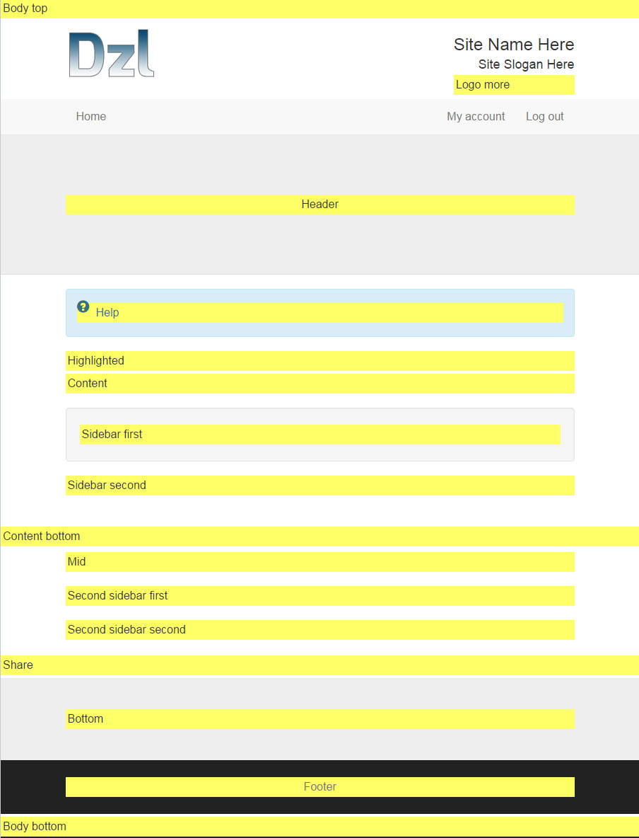
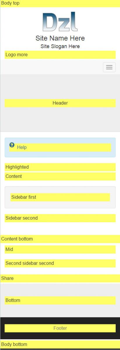
Below is the resulting layout of the "Dzl" Theme demonstrating the available regions we felt were helpful to provide more flexibility in theme development.
Desktop / High Resolution
Tablet / Mid Resolution
Smartphone / Low Resolution


